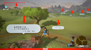
A task could be created by setting up a sign in the world, and then all related specs and meeting details related to it could be readily available by clicking on that sign. There’s also a “field task view” that was set up for higher level items. It was apparently a great way for multiple devs to bounce ideas off of each other in regards to the task.
From a field design standpoint they discuss the “Triangle Rule.” They explain that using triangles carries out two objectives- gives players a choice as to whether to go straight over the triangle, or around, and it obscures the player’s view, so designers can utilize them to surprise players, make them wonder what they’ll find on the other side.
There’s also variations that can be more visually interesting, to perk the player’s interest. Korok seeds are usually found in these instances. They have three different scales that they utilize this principle with as shown here — all to achieve different objectives. The slide notes that each different size plays a different role: the largest are landmarks that serve as visual markers, the medium sized triangles serve to obstruct the player’s view — whatever is behind them and the smallest triangles serve the tempo — be it to change whatever buttons the player is pressing or for more concrete play.
They also used rectangles as shown here. Instead of gradually revealing something, rectangles are good for completely hiding something from sight. You can get an idea for just how widely this concept was applied in this image. They give an example of how the design was applied in action in these images. Note how the structure in the distance is slowly revealed.
Finally, the structure hides the tower in the back, so there’s this chain of interest — hill -> bridge structure -> tower. The beginning of the presentation discusses what specific changes they made in order to make the game more enjoyable.
You can see in this image how the different structures rank in visibility — naturally drawing player’s attention, and in “objective.” The objective order changes depending on how the player likes to play-if they’re aggressive, they’ll go after enemy camps to get better gear.
The Japanese internet notes that devs were in awe, stating things like “only NCL knows how to really make games”.
From IGN Japan: One guy foresaw that the game would be too complex to leave debugging till the end, so he had the foresight to champion for new practices — proactively fix bugs blocking programmers and bugs specifically requested for fixing. Also to implement a tool for easy bug reports, merging the tools for managing bugs with tasks, and implementing a system in the game for bug finding called #ZELDA_ERROR.
Sources: [esuteru 1] [IGN 2]


No comments:
Post a Comment